BEFORE YOU DECIDE
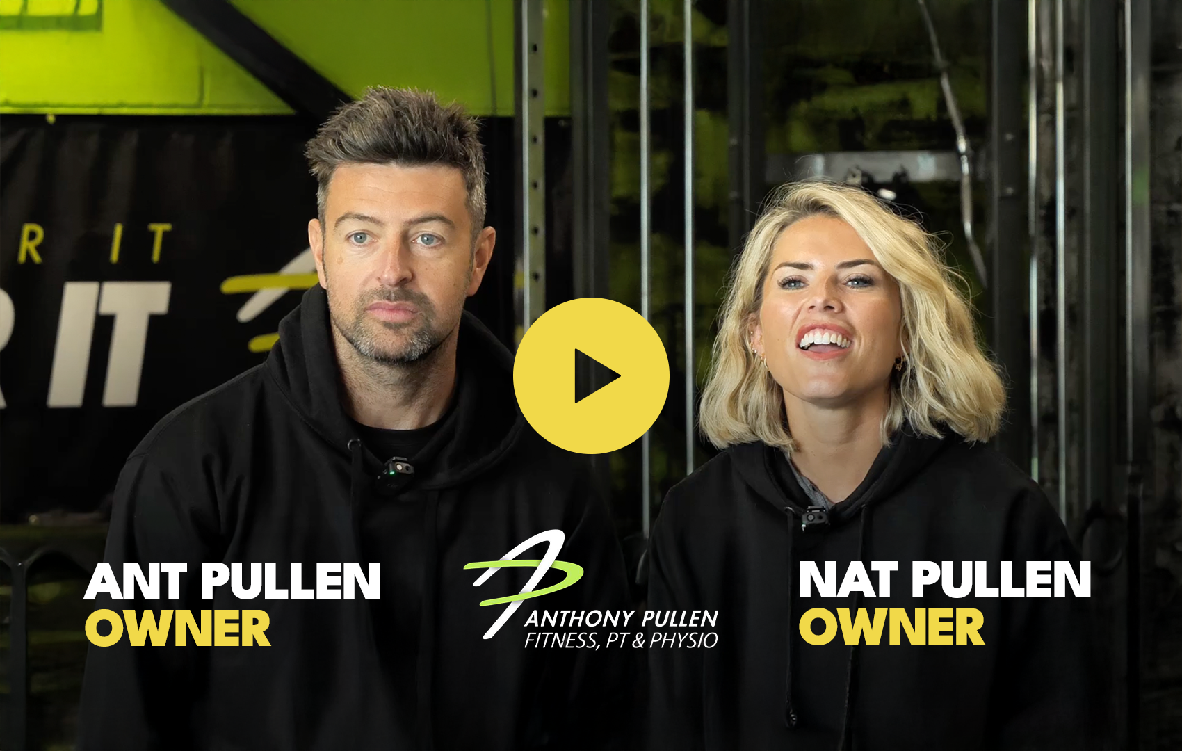
PT Studio: from “embarrassing website” → better-fit, higher-value clients
“Our Website Was Embarrassing”: How a PT Studio Rebuilt It Into a System That Attracts Better Clients Because the Website Couldn’t
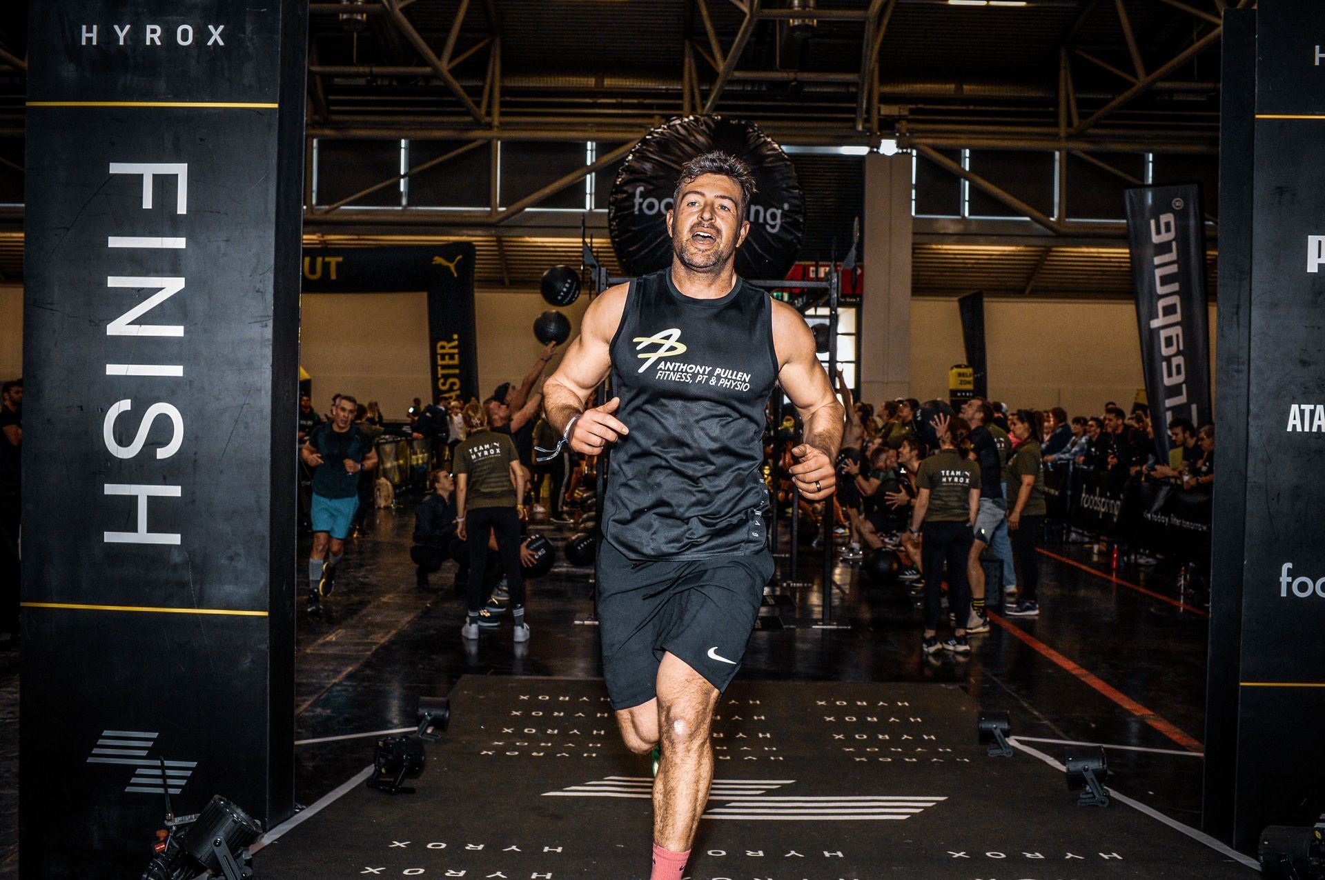
Anthony Pullen Personal Training is a private, family-run training studio with a strong community, high coaching standards, and real client results happening every day inside the gym.
The problem wasn’t the service.
It was that none of this was clear online.
When people searched locally, landed on the website, or tried to work out whether the studio was right for them, the answers weren’t there.
The experience, the environment, and who the studio was actually for were all unclear.
That created a simple commercial risk:
People who would have been a good fit couldn’t confidently choose the studio - so they kept looking.
THE DIAGNOSIS
The Studio Was Doing the Work - But the Website Was Hiding It
Ant & Nat had built a business that worked in real life:
- a private, family-run studio
- high coaching standards
- a strong community
- real client results
But none of that translated online.
Visitors couldn’t clearly see:
- What made the studio different from commercial gyms
→ meaning the business was compared like-for-like with big gyms, despite offering a completely different experience. - What training actually looked like day-to-day
→ making it hard for prospective clients to picture themselves there or feel comfortable taking the first step. - Who the studio was for - or whether they’d feel comfortable there
→ increasing hesitation, especially for nervous or self-conscious visitors. - Real outcomes or transformations from people like them
→ removing reassurance at the exact moment trust was needed.
Key parts of the business were either missing or underdeveloped online:
- Incomplete team information
→ making the business feel impersonal and harder to trust. - Inconsistent or low-quality imagery
→ creating doubt about professionalism and quality. - No clear showcase of the private facility
→ preventing visitors from understanding how different the environment actually was. - No explanation of coaching style, support, or progression
→ leaving people unsure what would happen after they joined. - No clear reason to choose this studio over larger gyms
→ forcing visitors to default back to familiarity instead of value.
So when people arrived, they didn’t think:
“This feels right for me.”
They thought:
“I’m not sure… I’ll keep looking.”
That’s what an unfinished website does.
Not because the business isn’t good - but because it hides the very things that make it worth choosing.
WHY IT WASN’T WORKING
People Don’t Join Because of Features - They Join When They See Themselves Succeeding
The website didn’t underperform for one reason.
It underperformed because several critical elements were missing at the same time.
- It wasn’t built around how people search for personal training locally - or what makes them feel confident enough to enquire
→ meaning the studio struggled to be found by people already looking for help. - There were no clear buying paths
→ meaning thewebsite wasn’t guiding visitors calmly from interest to enquiry. - Social proof existed inside the studio, but barely appeared online
→ meaning trust had to be rebuilt from scratch on every enquiry. - Messaging described services, not outcomes or lived experience
→ meaning visitors couldn’t picture what would actually change for them. - Emotional barriers - confidence, self-consciousness, safety - weren’t addressed
→ meaning hesitation went unanswered.
In personal training, this matters more than most industries.
People don’t decide logically.
They decide emotionally - based on:
- how they look
- how they feel
- how confident or self-conscious they are
- whether they feel understood, supported, and safe
If a website doesn’t address those emotions, people don’t enquire.
They don’t commit.
They don’t choose.
That’s why the site didn’t rank.
That’s why visitors didn’t progress.
That’s why interest didn’t convert.
It would have been easy to assume the solution was louder messaging or competing more aggressively - but that was never the problem.
The studio wasn’t trying to win on size or price. Bigger gyms already own that ground.
The issue was simpler and more structural: the website failed to show why the experience was different - and who it was actually for.
Until that contrast was clear, visitors defaulted to what felt safer and more familiar.
The website wasn’t neutral.
It was actively working against the business.
THE STANDARD
A PT Website Has One Job: Make the Right People Feel Confident Enough to Act
Ant & Nat didn’t need a better-looking website - they needed a conversion-focused website built to attract aligned, higher-value clients.
They needed a website that could:
- be found by people actively searching for help
- clearly explain who the studio is for - and who it isn’t
- show real people, real coaching, and real environments
- make nervous or self-conscious visitors feel understood
- demonstrate outcomes before asking for trust
- make joining feel safe, simple, and obvious
That doesn’t happen through decoration.
It requires clarity in how the business is positioned, how trust is built, and how decisions are guided.
The standard is simple:
If a website can’t clearly explain the experience, build trust early, and guide decisions calmly - it won’t grow the business.
THE OPERATION
Showing Clearly What Training Is Actually Like - Before Someone Enquires
The existing setup couldn’t support that standard.
Not because it was poorly intentioned - but because it was never designed to carry this level of responsibility.
So the website was rebuilt with clarity and conversion as the priority.
Everything ran through one question:
“Can someone understand exactly what training here would feel like -before they ever get in touch?”
To make that enforceable:
- Page structure was rebuilt around how people decide, not how gyms describe themselves
- Messaging was rewritten to address real fears, goals, and objections - not fitness clichés
- Design focused on people using the space, not empty rooms
- On-site video captured:
- the environment in use → so visitors could picture themselves training there
- the coaching style in action → to show how support actually works
- the atmosphere and community → to remove fear and intimidation
- real client experiences → to provide reassurance without persuasion
- Video testimonials and FAQs answered trust and commitment questions early
- Service pages qualified visitors before they enquired
Nothing existed just to fill a page - every section had to build trust, reduce hesitation, or move someone closer to enquiring.
Every element had one job:
Show the experience, set expectations, and remove doubt.
THE OUTCOME
From Rare, Hesitant Enquiries to Confident, Aligned Clients
Before the website reflected the reality of the studio, growth relied heavily on effort and explanation.
Once the new system was in place:
- People could clearly see what the business was about
→ so the right visitors stayed instead of second-guessing. - Visitors arrived already informed and aligned
→ reducing uncertainty and filtering out poor-fit enquiries. - Conversations started further down the decision path
→ making growth easier to manage and less draining. - The studio no longer had to explain everything from scratch
→ removing pressure from the owners and shortening sales conversations.
As Ant put it:
“People used to land on our old site and leave.
Now they land on it and want to join.”
The website stopped existing passively and started actively attracting better-fit, higher-value clients.
It became a system that attracted the right people - and filtered out the wrong ones.
WHAT CHANGED DAY-TO-DAY
The Pressure Came Off - Because the Website Did the Explaining
The biggest shift wasn’t just visibility - it was how confidently people were arriving.
It was how the business felt to run.
- Fewer awkward conversations
→ because expectations were already set. - Less explaining and convincing
→ because trust had been built before the first message. - More aligned enquiries
→ meaning better conversations and fewer dead ends. - Clearer expectations from day one
→ creating smoother onboarding for clients.
The studio didn’t change.
The friction did.
And when friction is removed, growth becomes calmer, more predictable, and easier to manage
“Our Old Website Rejected People. This One Brings Them In.”
"Our old website didn’t just fail to help - it actively pushed people away. Now people see the studio, the atmosphere, the results - and there are no questions anymore. It’s literally: ‘How do I sign up?’”
NEXT STEp
Before Changing Tactics, Check Whether the Structure Is Working Against You
If your website isn’t clearly structured to explain your business and build trust early, it creates silent risk.
Not because your service isn’t good - but because people can’t confidently choose you.
Before spending more on ads, content, or visibility, the sensible first step is always the same:
Check whether your website is helping people decide - or quietly pushing them away.
That clarity is where better decisions start.
WHO WE ARE
ABOUT ASHBY DIGITAL
Performance-first marketing and websites. Built to generate enquiries and measurable ROI.
OVER 50+ VERIFIED REVIEWS
real stories. real support. real results.
THE NEXT STEP
DISCOVERY SESSION
See the difference between your current setup and performance-first delivery - and what that change would mean for your enquiries and revenue.
THE DIAGNOSIS
CLARITY SESSION
Not sure what’s wrong - or what to fix first? We’ll show you what’s actually holding results back.
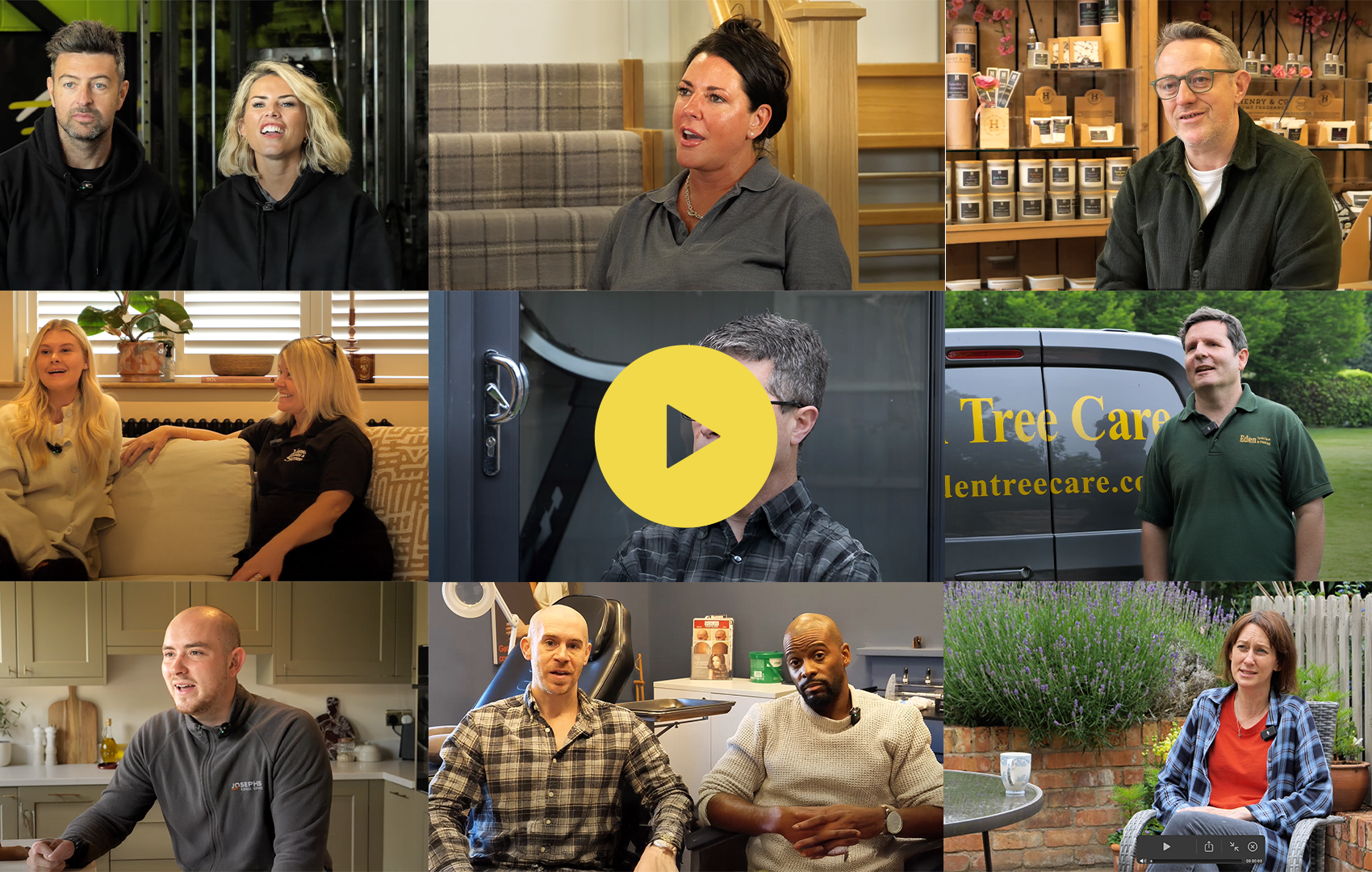
THE RECEIPTS: WHAT REAL CLIENTS THINK
THIS IS WHY WE EXIST, STORIES LIKE THESE
Live Google & Trustpilot reviews - exactly as clients left them. No edits. No selection.
READ FULL STORY - BEFORE, DURING AND AFTER
These Aren’t Just Success Stories. They’re Turning Points.
Before the testimonials and results, there were messy backstories. Websites that didn’t convert. Content that didn’t work. Growth that felt harder than it should. These case studies break down what wasn’t working, the decisions that changed everything, and how those changes played out in the real world.